How to Create a Google Form for Event Registration
Looking for a simple way to collect registrations for your upcoming event?
Feeling a bit bamboozled by all the software options available, and want something that's quick?
Google Forms is a great option. You'll love it! I'll talk you through everything from start to finish. By the end of this article you'll have a great looking form you can send out to your attendees.
Why Google Forms
Google Forms is one of the best free form builders available. It's got a clean, simple to understand user interface that even your granny could use!
It's free for unlimited responses. That's a big one! Especially if you're hosting an event with a lot of attendees. There's plenty of other form builders around, but usually they only allow a certain number of responses and then there's a credit card required.
It's also a Google product (in case that wasn't obvious). And you've probably already got a Google account, so getting started is going to be super quick.
Create a Google Form
Let's get this show on the road...
Head to the Google Forms website. It'll look something like this:
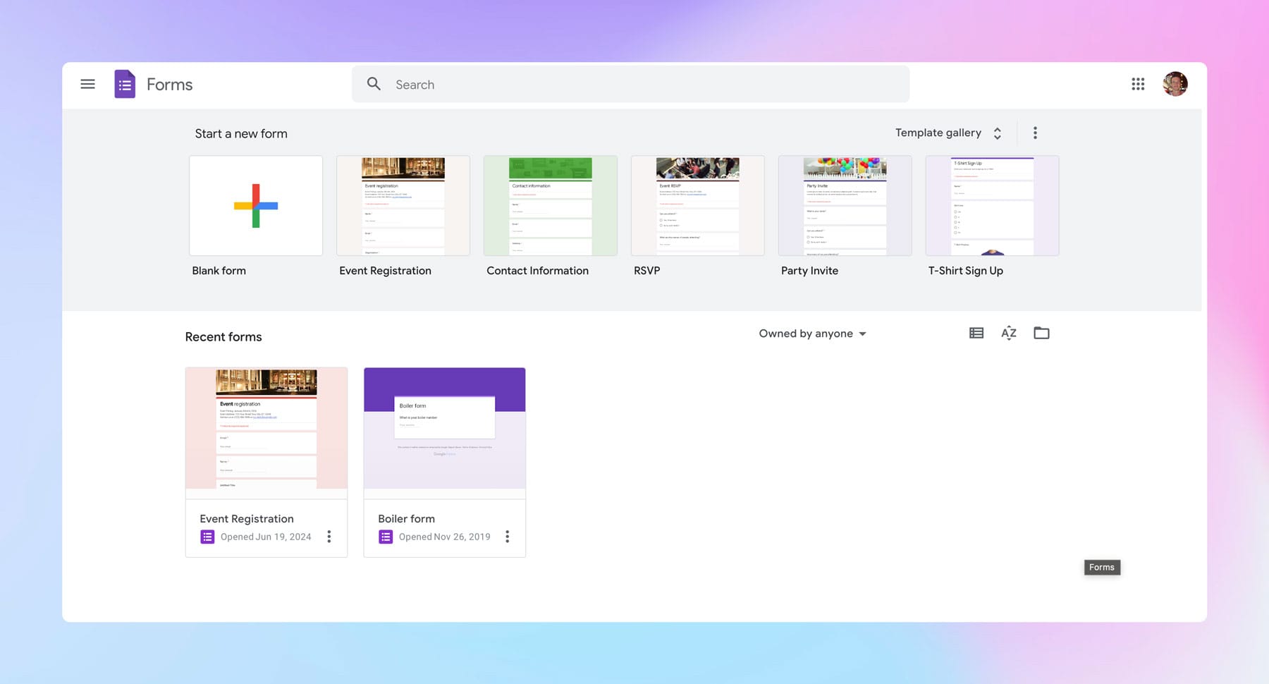
You can either create a blank form, or use one of the templates. If you've never used Google Forms before, I'd highly recommend using the 'Event Registration' template. It's simple to edit to your requirements and gives you a good starting point, rather than a blank form.
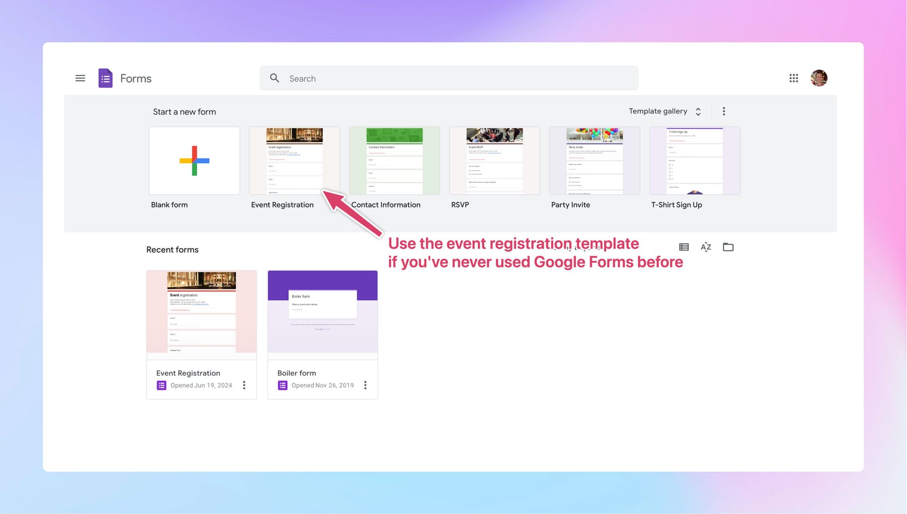
When you click the template, you'll get taken to the Google Form editor:
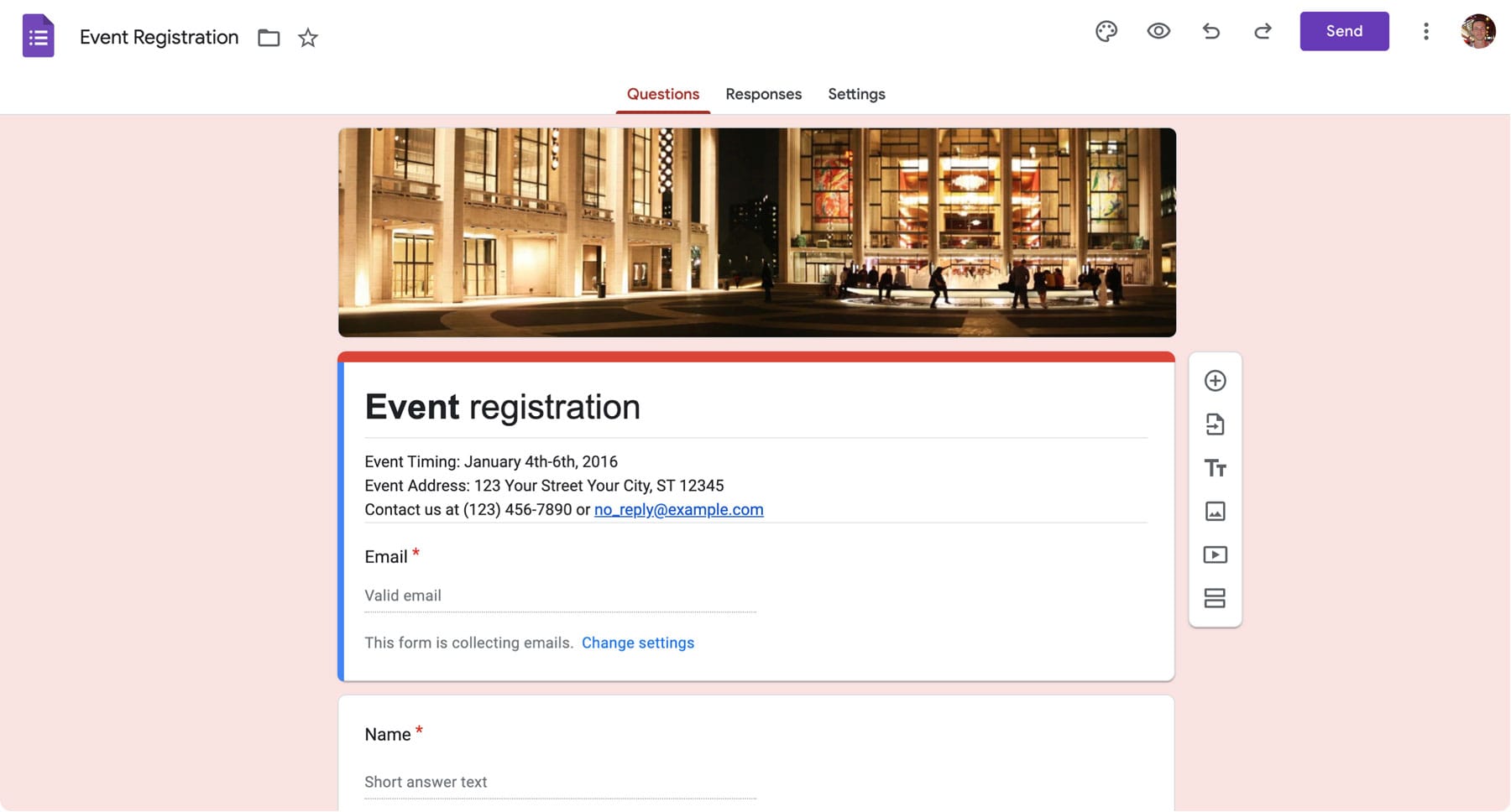
The four important parts of Google Forms for event registration
Now, if you've never seen this screen before, it can be a little bit intimidating as there's a whole bunch of different options. But not to worry, I'll take you through everything you need to know to make the best event registration form.
There's four main sections that we're going to focus on:
- 1. Theme settings
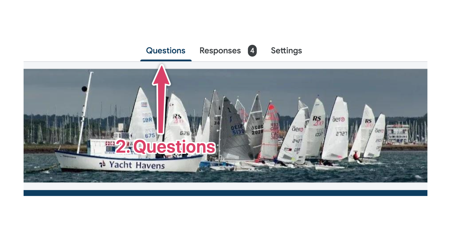
- 2. Questions
- 3. Responses
- 4. Settings
We'll want to change the options in all these sections to make a great form.
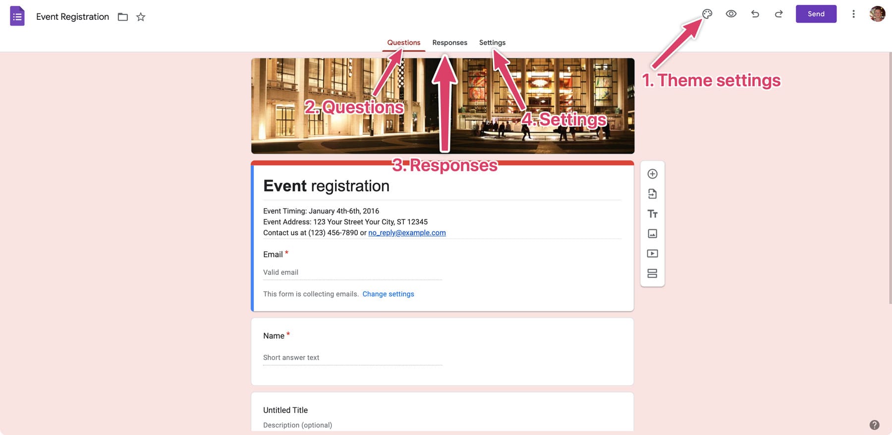
1. Theme settings
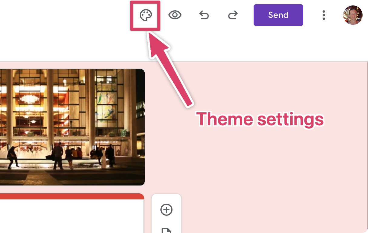
It's vital to remember, that after you've built your form, you'll be sending out links to access it to each your attendees. When your attendees see the form we want it to feel like part of your brand.
People are more cautious of spam than they've ever been. By styling the form to match your business, people are less likely to think it's junk and more likely to actually complete the form. It also looks a lot more professional for you and your brand.
In my example, I'm going to be collecting registrations for a 'Dinghy Regatta' at my local sailing club 'Lymington Town Sailing Club'.
Let's have a look at the club's main website, as this is what we want the form to look like.
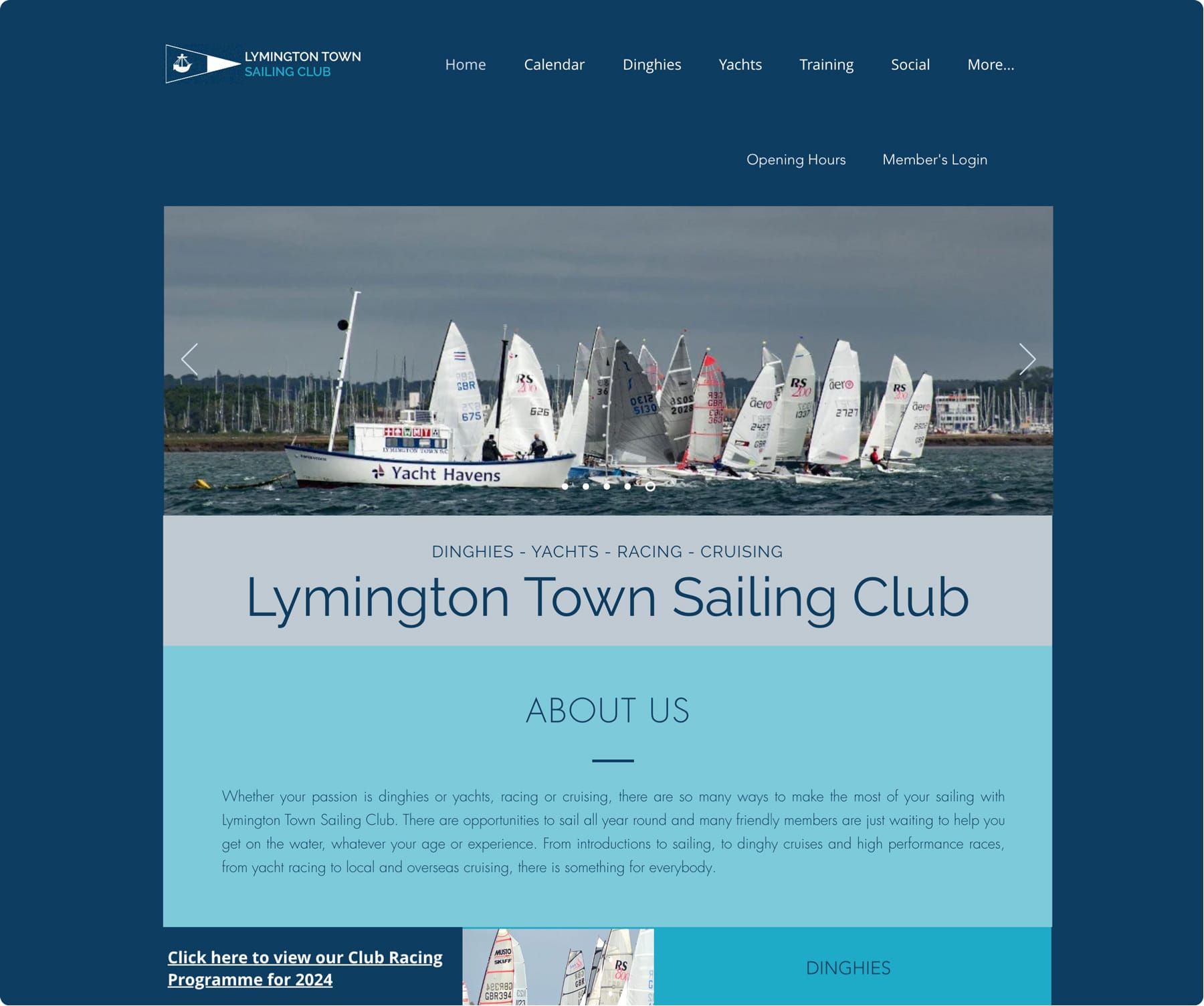
I can see a few things here that we can take to our Google Form:
- The website uses the 'Open Sans' font (I admit I asked the site administrator for this information).
- Use blue as their main color.
- The sailing club logo would be good to get in our form.
- Maybe that header image with the dinghies might be useful too?
Let's head back to our theme settings in the Google Form.
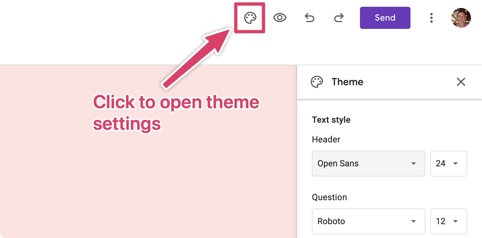
Using the information from the above, I changed the theme settings to take my form from this:
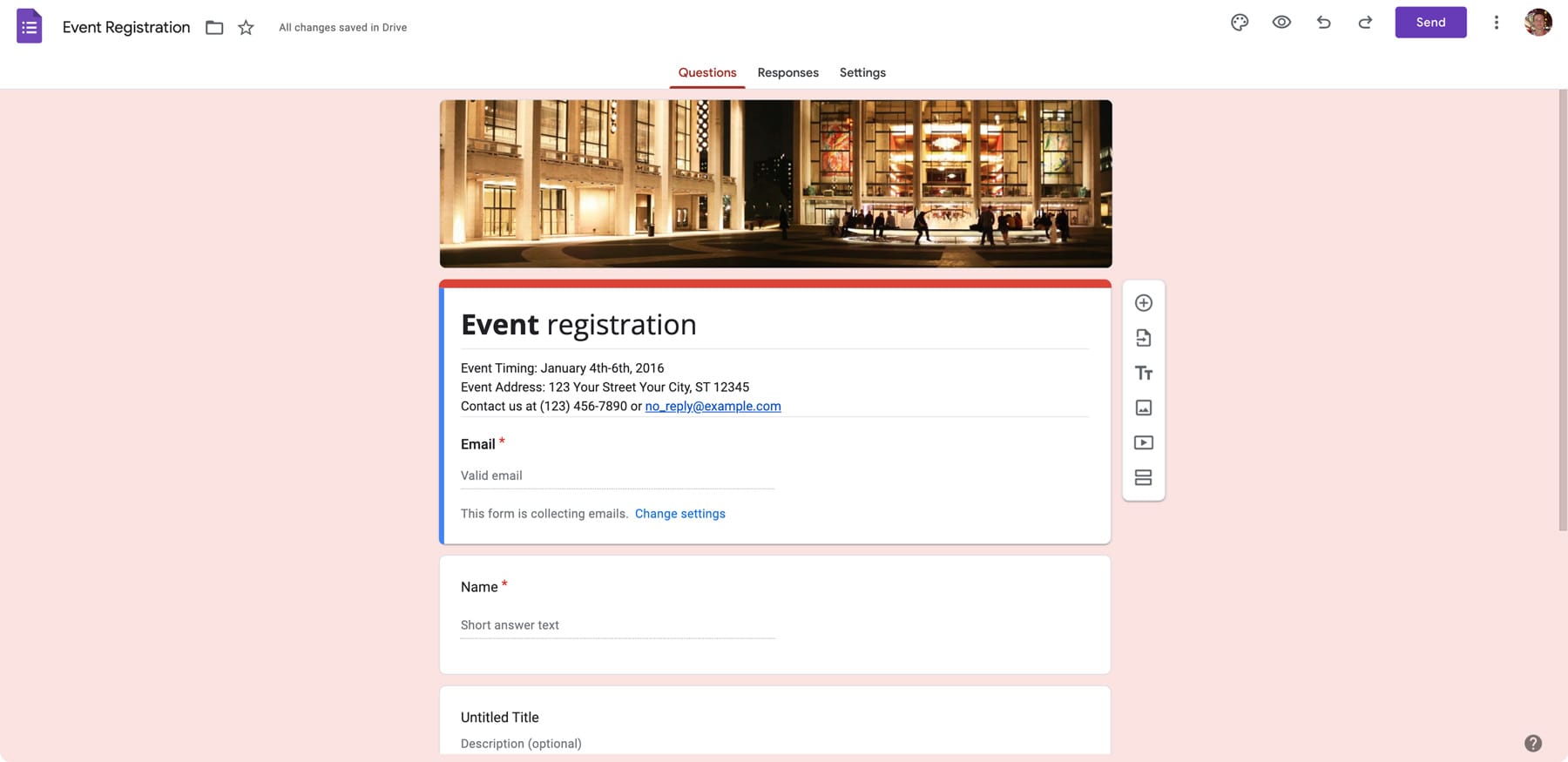
To this:
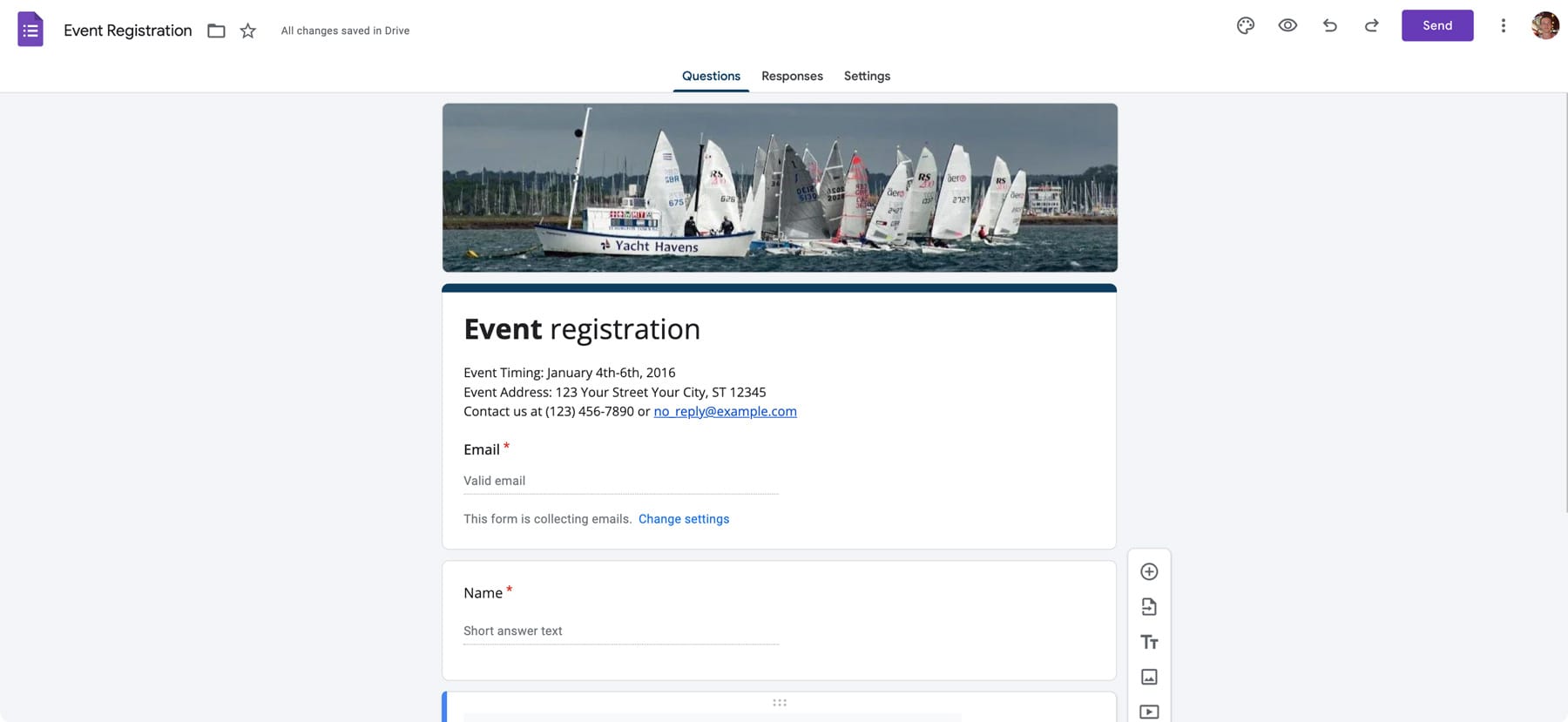
How much better does that look! Actually looks like something you would be proud to send out to your attendees now.
2. Questions
Event name, date and contact number
The questions section let's you control everything about the form itself.
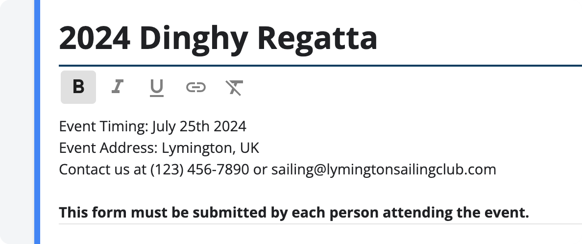
It may sound very obvious, but make sure at the top of the form you have:
- The name of the event
- The event time and date
- A contact number
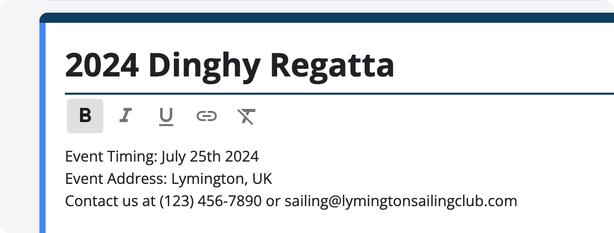
(The template is great for this because you can just change the details that are already there)
Adding and editing questions
It doesn't take too long to get up to speed with adding, editing and deleting questions in Google Forms..
Click on a question to edit it and the controls on the right give you all the tools you need.
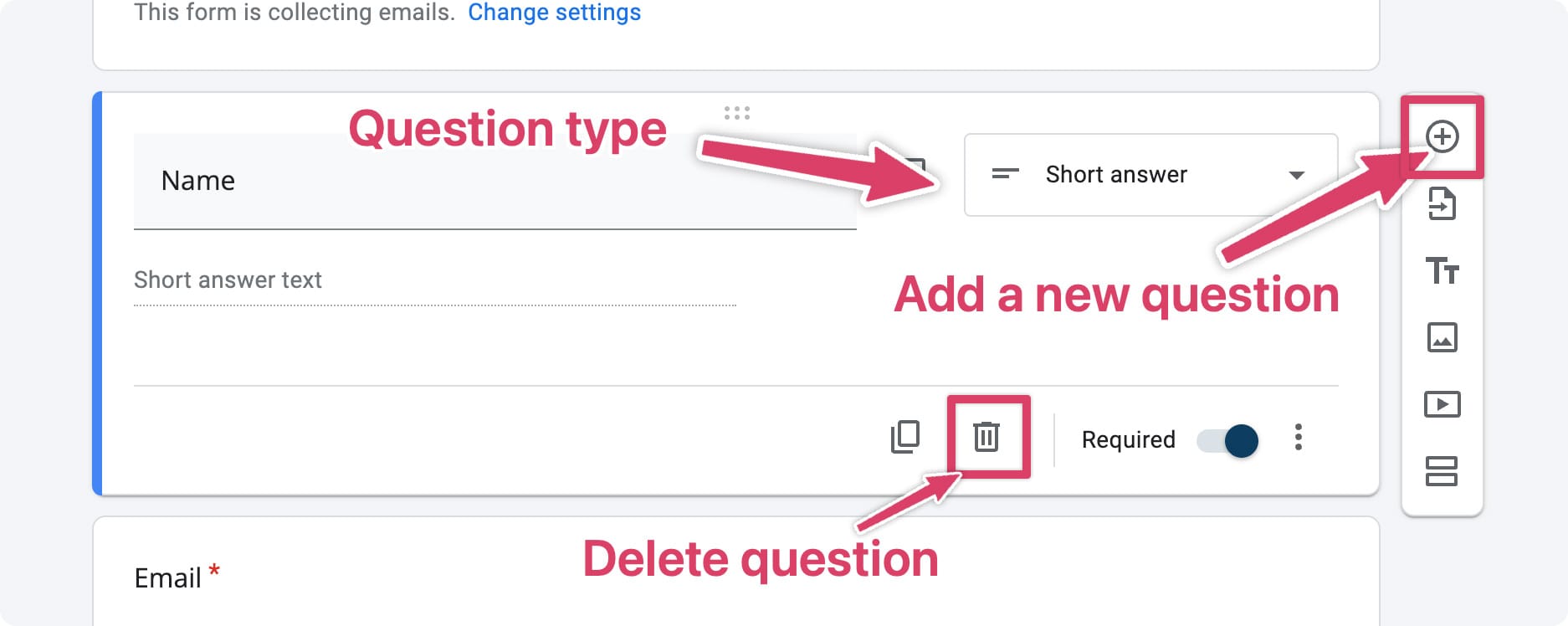
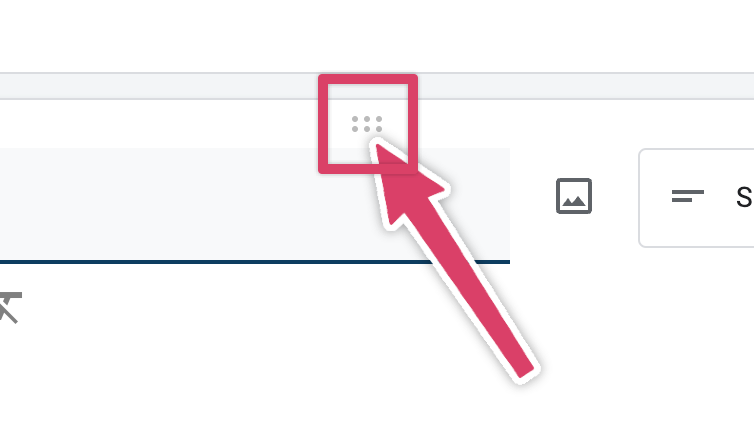
Use the 6 dots to drag with your cursor and change the order of questions:
Form validation
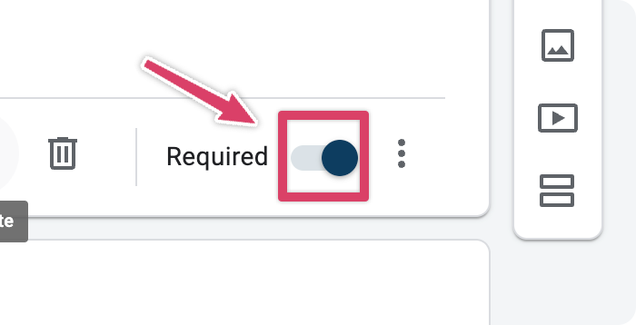
Be sure to check the 'Required' option for any questions that you need answers too. This will prevent the user from submitting the form unless they complete this section.
Make a event registration form people want to fill out
What do I mean by this?
Never forget that this form is a job for someone. They want to come to your event, and they're willing to put in some work to help you out by registering for the event. But don't take liberties or it might bite you in the bottom.
I'm sure you've opened a form before (I'm looking at you car and home insurance) and seen what feels like 100's of fields to fill out and thought..."forget this".
I wrote all about this here. But if you make the form too much effort to fill out then you're going to lose attendees.
Only ask the questions that you need answers too. Keep it as short and sweet as you can.
Multiple attendees per form submission
Have a think about whether you want to allow multiple attendees per form submission.
For example, if a family of 4 wants to sign up to your event, do you want each person to individually submit the form? Or are you happy for one person to submit one form on behalf of their group?
If each person needs to submit the form, it's worth stating this at the top.
If you're happy for people to submit on behalf of a group, you might want to add a question like this...
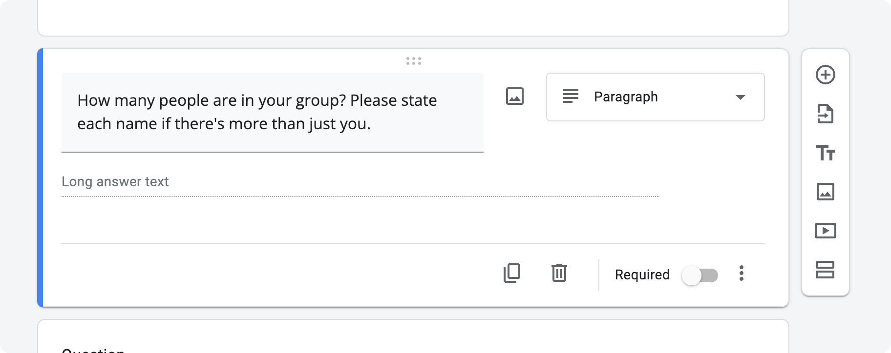
This does get a bit 'messy' as it makes it difficult to see exactly how many people have signed up for your event. But it's a balancing act between that and giving people significantly more work by having them fill it in per person.
Unfortunately there's no better solution to this in Google Forms at the moment.
3. Responses
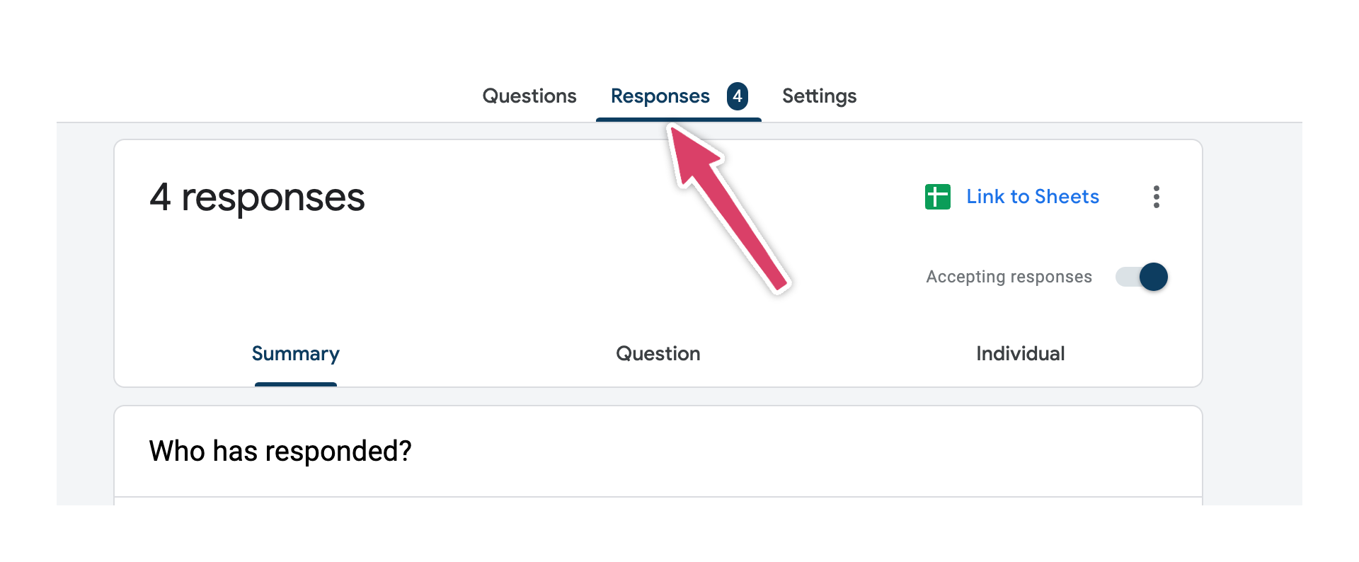
See who's coming
There's not too much to say about this section. This is where you'll see all the details of your attendees as they come in. 🙌
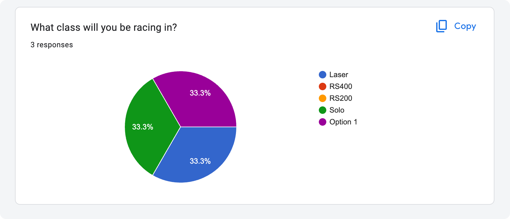
Google does give you some useful form analytics which is great way to get a overview of things.
Prevent anymore attendees from registering
As your event approaches, and you're ready to turn off registrations, you can do that by clicking the 'Accepting responses' button:
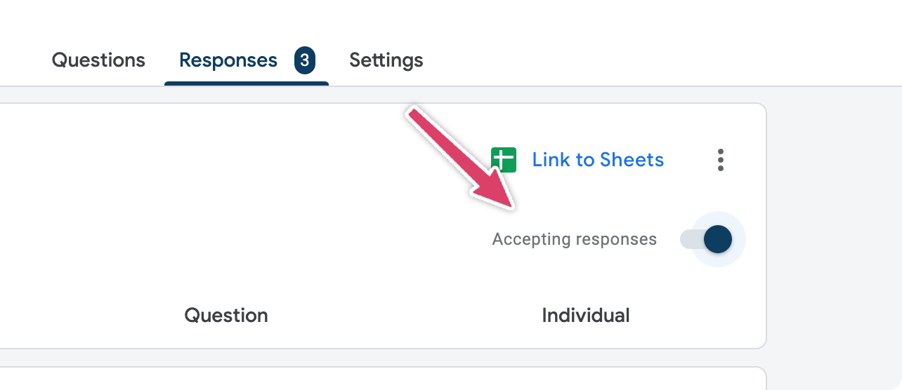
This will disable any other attendees from registering.
4. Settings
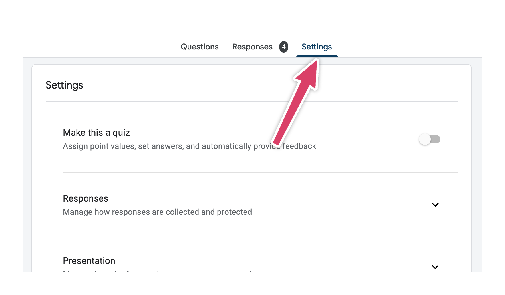
There's a whole bunch of different options in here, but I'll talk you through the most important for setting up event registration:
Collect email addresses
It's highly likely you're going to want to collect your attendee's email addresses.
To do this, I'd recommend setting 'Collect email addresses' to 'Responder input'. This lets your attendees manually type their email address in.
There is an option to force people to sign into Google to respond, but I don't think this makes sense for event registration. This is going to have a negative impact on the amount of people that sign up for your event.

Send your attendees a copy of their registration

For event registration I'd recommend changing this setting to 'Always'.
It can be frustrating as an attendee if you register for an event, and then there's nothing in your inbox to prove that you registered for the event.
If you don't send a copy of the response to your attendee you're likely to get questions like:
- "I'm not sure if I registered properly or not?"
- "Can you remind me what I put on the registration form?"
...so best to leave this set to always.
Allow attendees to modify their response

This one's up to you.
What's good is that you can turn this off after the person has registered. That means that leading up to the event you can let people change their information but then a few days before the event turn self editing off.
The downside is this can be a bit of a nightmare for your administrative purposes.
Confirmation message
Add a custom confirmation message. This message appears on the registration form page after the person registers. It does not appear in any email they receive.
The main thing your attendees are looking for here is 'what happens next'. Tell them what's going to happen now that they've registered.

Limiting responses
Be very careful turning the 'Limit to 1 response' option on.
It works by forcing the attendee to sign into their Google account, so that they can only register once per google account.

This might be fine. But if you're asking people who use the same computer to submit the form once per attendee this can introduce a lot of friction. For example a family of four, might not even have a Google account each. And having to log in and out of Google accounts to complete the form can be a pain.
If in doubt, leave this off.
Share your form
Whoop! You've built your event registration form and you're ready to share it with the world...well - you're attendees.
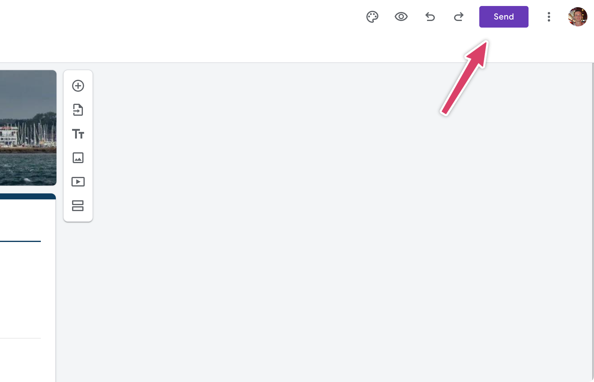
Hit the send button in the top right to see your options:
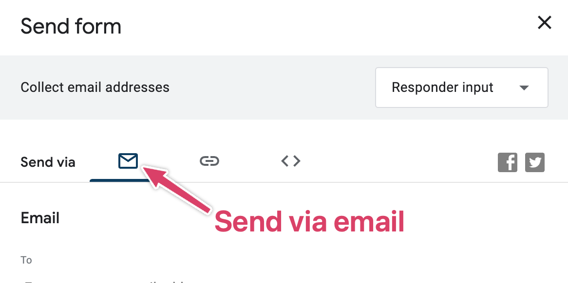
1. Send via email
This sends your attendee an email that looks like this:
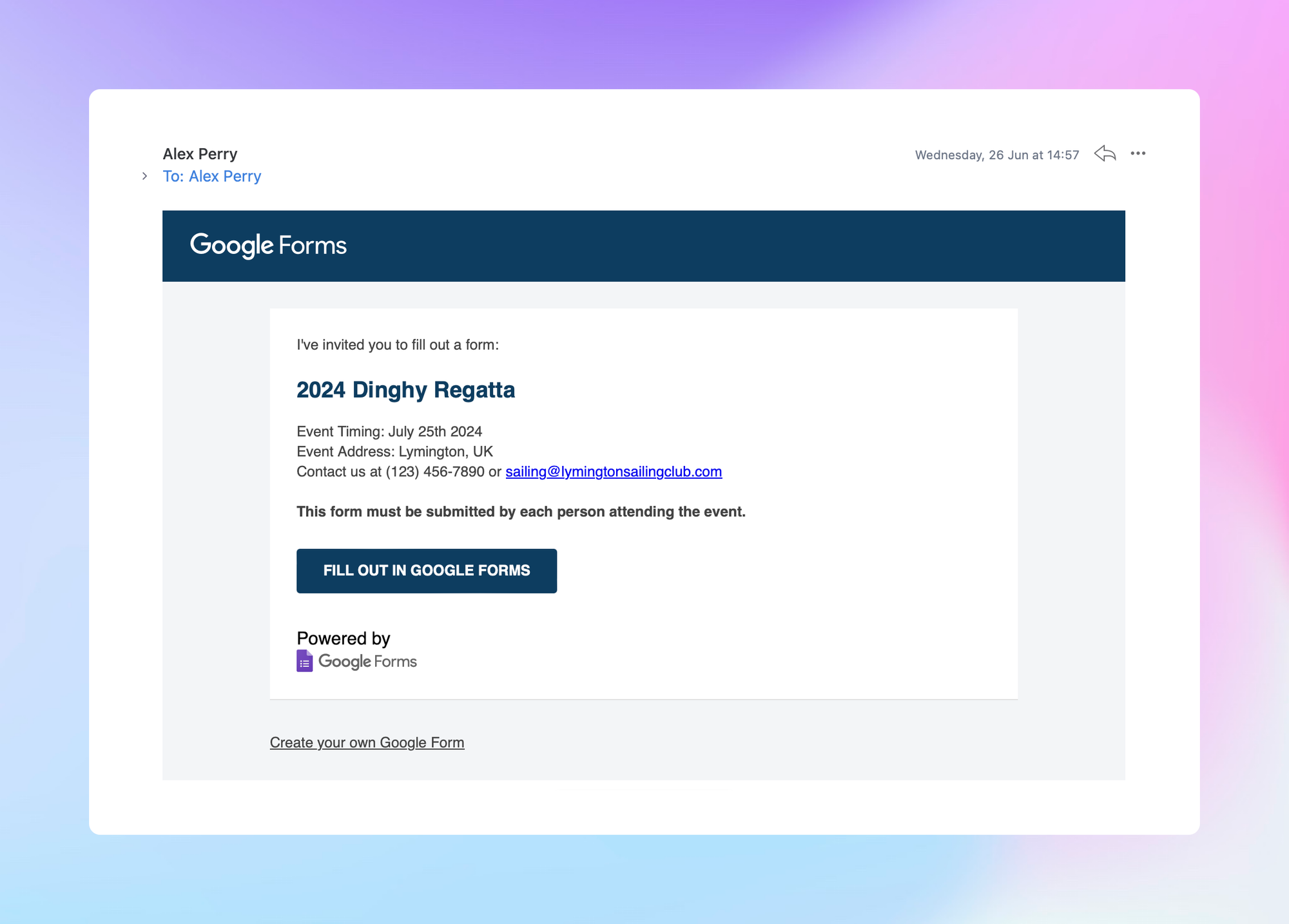
This works as a quick and easy option, but there's a few reasons I think there's better options:
- It's got Google's branding all over it. Not yours.
- It comes 'out of the blue' for the attendee. There's not much context to it and it's likely to go ignored.
There's also the option to embed the form directly in the email:
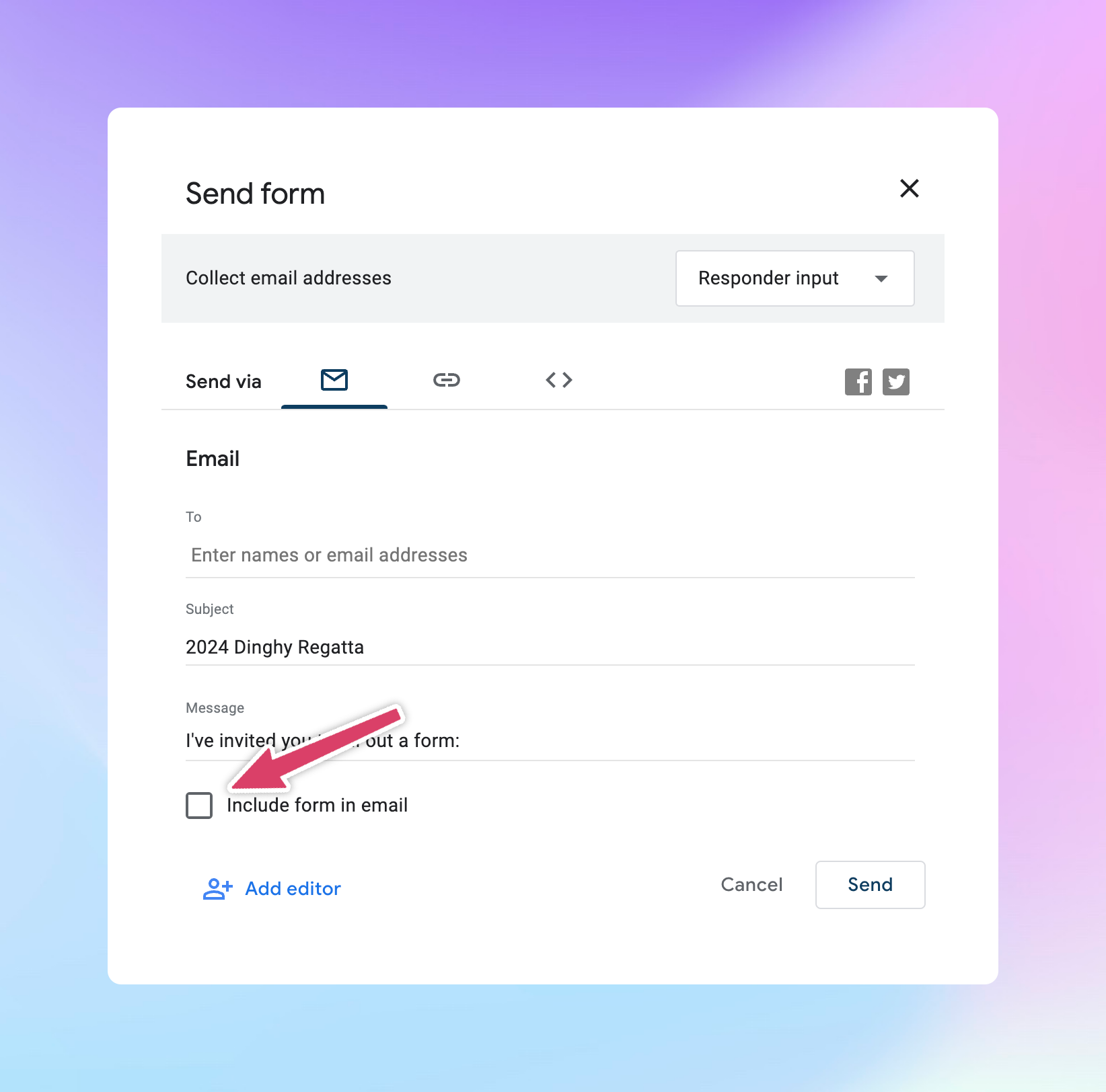
But this doesn't work in all email clients. So you need to be careful who your sending it to if you use this option. My recommendation is to leave this off.
2. Send via link
This is my favourite method by far, and how I recommend sharing your registration form.
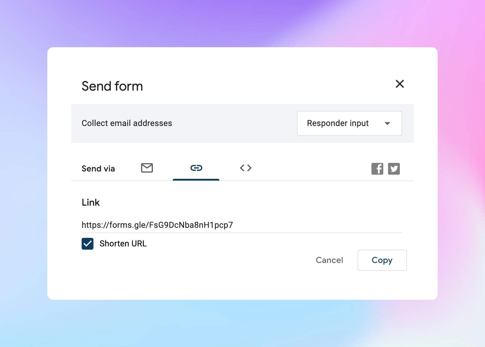
Sending by link allows you to send out a link to your potential attendees in the same way you would usually communicate with them.
Hot tip: Choose the 'Shorten URL' option to get a much prettier URL.
Do you have an email subscriber list? You could send them the link in an email in a way that is personalised and gives context.
A very simple email will do:
Hey [attendee name],
Just a heads up that we've opened up registrations for the Lymington Dinghy Regatta. Can't wait to see you there!
Sign up by using this link
-https://forms.gle/FsG9DcNba8nH1pcp7
All the best,
The Lymington Sailing Club Team
That's way better than this thing:

(No offence Google!)
You could also very easily add this link to your website to allow attendees to sign up.
3. Embed via HTML
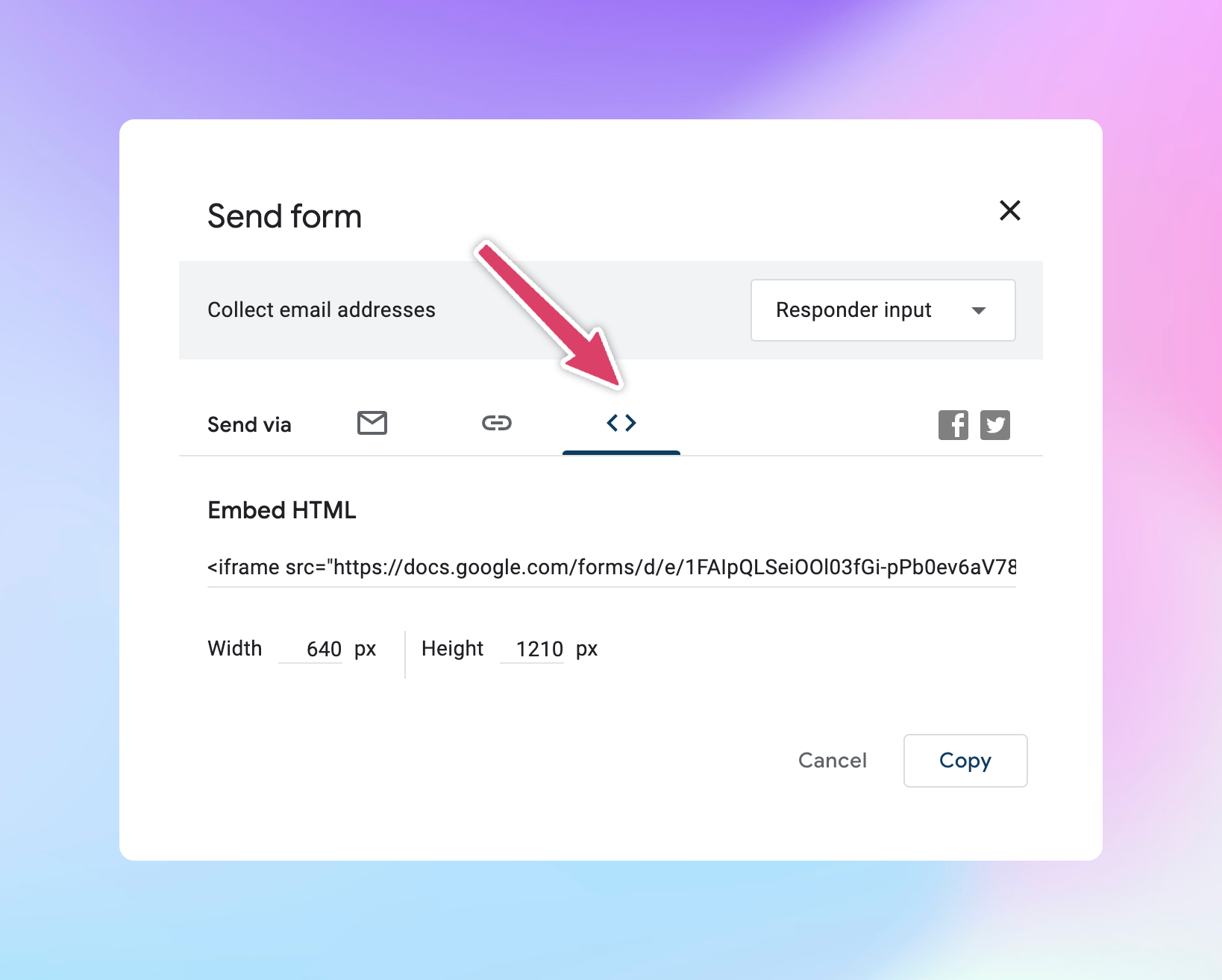
There's a way to embed the form directly on your website.
This can work well, but again, be careful. I tend to only recommend this method to people who are very familiar with HTML.
The way Google gives you the code to embed it is with a fixed width Iframe. This may not work properly on mobiles, so proceed with caution!
The limitations of using Google Forms for event registration
Google Forms is ultimately a form tool, not an event registration tool, so it falls down in a few places.
It's worth reviewing these before setting up your form to make sure your ok with them.
There's no way to natively embed the form on your website
As we've seen in the previous examples, the only way to add Google Form to your website is with the 'Iframe' embed. There's no way to add it to your website natively.
This isn't an issue with everyone but if you're looking for more advanced features this can be limiting.
No way to accept payments
There's no built in way to accept payments with Google Forms.
One way around this is to manually request payment from your attendees with another system after they register. But this is very labour intensive.
No way to limit the number of event registrations
What if your event only has 50 places? There's no way in Google Forms to prevent 100 people from signing up. Instead you need to be constantly watching your registrations and then manually close the form once you've hit a limit.
This is difficult to do in reality.
No way to automate event emails
There's no way to send automatic event reminder emails, or follow ups after the event.
It can be hard to see how many people are coming
If you allow groups to sign up using one form it can be very difficult to see exactly how many attendees to expect to your event.
Looking for a more powerful way to collect registrations for your event?
Google Forms is great because it's free. But with that, comes a limited set of features and software that wasn't built for event registration.
Event Calendar App let's your attendees register directly from your own website with non of the limitations that Google Forms has. Give it a try! 👍

